Create a Luxury Hotel Website That Wows: A Step-by-Step Guide
When travelers land on your hotel’s website, they should feel like they've entered the digital equivalent of your grand lobby. After all, your website isn’t just a place to book rooms; it’s the first warm smile, the first welcoming handshake, the first impression, the first taste of the experience you offer. Let's talk about how to make sure your online presence is as premium as your hotel itself.
Align Visual Elements with Your Brand
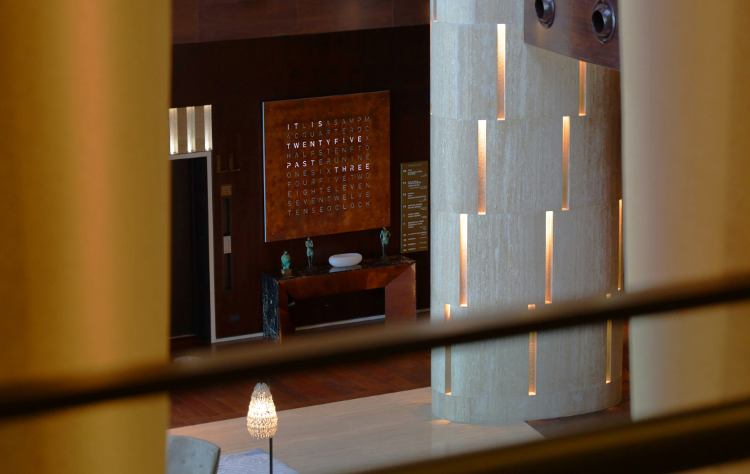
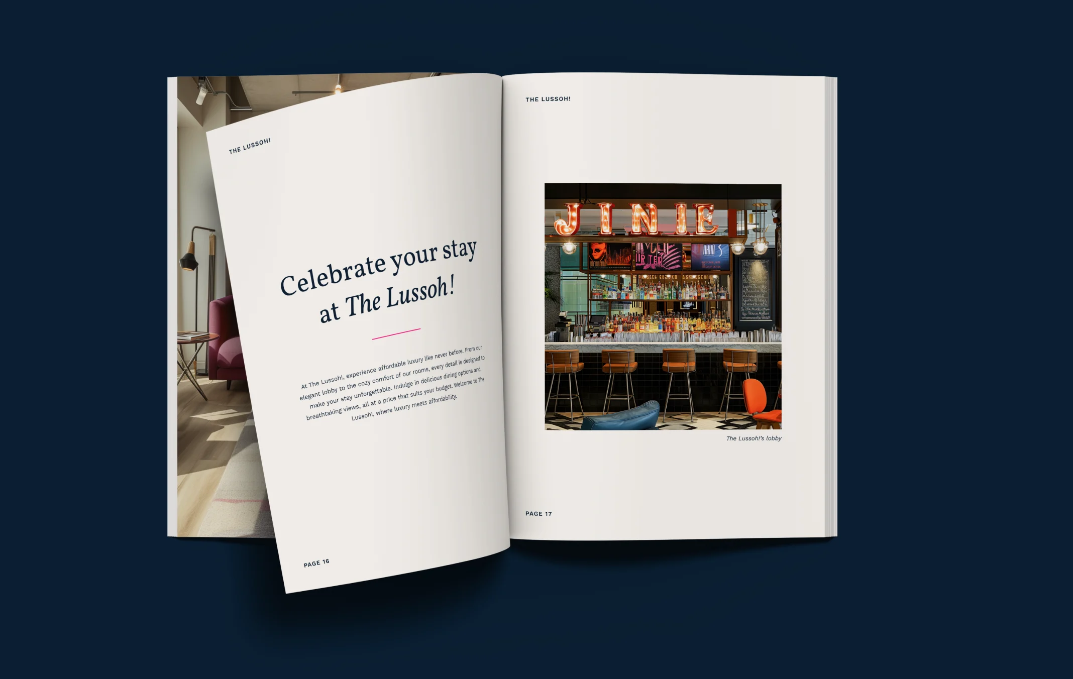
Think of your hotel’s website as the cover of a high-end magazine. The visuals need to be striking, cohesive, and reflective of the luxury you promise. Utilize your brand’s colors, fonts, and high-quality images to create a sophisticated and seamless presentation. Each visual element should scream, "You deserve this elegance!"
Here’s why this is crucial: Consistency builds trust. If your hotel is all about opulence and comfort, but your website looks slapped together with random colors and low-res images, you’re sending mixed messages. Hospitality Marketing Professionals, we know your pain—tight schedules and the constant need for top-notch design that fits the industry’s unique demands. You'll feel relief knowing your website perfectly mirrors your premium brand.
Design with User Experience in Mind
Now, let’s talk usability. Imagine walking into a hotel where the reception desk is hidden and room numbers are random. Frustrating, right? Similarly, your website should be designed to be user-friendly with intuitive navigation and fast load times. This not only reduces bounce rates but ensures your visitors stay longer, engaging more with what your hotel has to offer.
A simple, clutter-free layout combined with easily accessible menus can make a massive difference. Make booking a room as smooth as silk—fewer clicks, less friction, and just the right amount of guiding users to where they need to be. For the tech-savvy traveler, a slow website is like a luggage delay—unacceptable. Speed matters, so keep those load times quick to retain the attention of your potential guests.

Use High-Quality Content and Professional Imagery
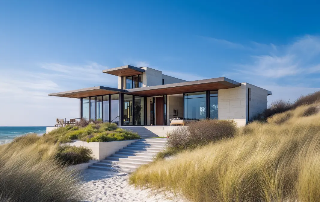
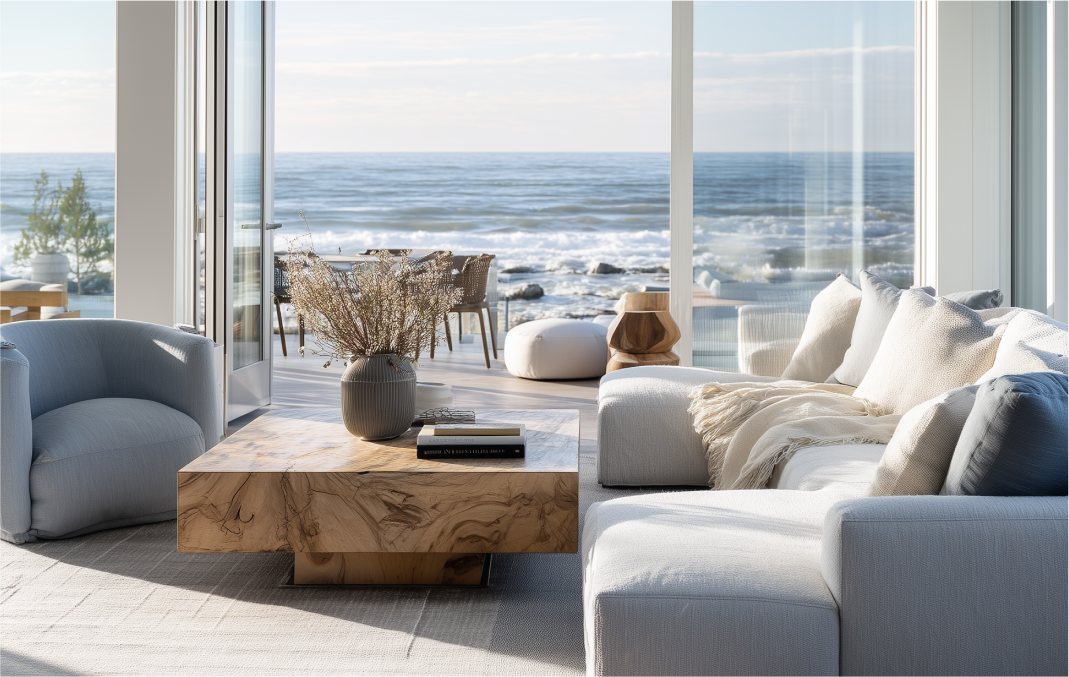
A picture is worth a thousand words, but a well-written content piece can book a thousand rooms. You need both. Content on your website should vividly showcase the luxury your guests can expect. High-quality imagery is essential here—think beautifully lit room photos, enchanting snapshots of your amenities, and captivating views of local attractions.
This isn't just about showing off; it's about storytelling. Describe the plush bedding, the exquisite dining experiences, and the serene spas in a way that makes visitors say, "I want that." It's about creating a narrative that aligns with their desires for comfort and indulgence.
Bringing It All Together
Creating a sophisticated online presence for your hotel isn't just a box to check off on your to-do list—it's an integral part of your brand's success. By aligning visual elements, focusing on user-friendly design, and employing high-quality content and imagery, you can create a website that doesn't just inform but also entices and converts visitors into loyal guests.
Hospitality Marketing Professionals, your main struggles—streamlined workflows, consistent high-quality design, and effective storytelling—can be addressed. At Be Indigo, we specialize in transforming these elements into a cohesive, high-end digital experience for your clients. Let's ensure that your online handshake is as firm and welcoming as the one your guests will receive in person.
Conclusion
In summary, your hotel’s website should be a reflection of the luxury you offer in real life. Nail the visual consistency, prioritize ease of use, and leverage high-quality content and images to tell a compelling story. Not only will you enhance your brand’s online presence, but you’ll also make sure your visitors feel the opulence from the moment they click onto your homepage. This is not just a website; it is an experience waiting to unfold for every potential guest.








%20Email%20Design%20Review%20Thumbnail%202x%20534%20x%20349.webp)


